
Painting with colors and water blended is known as watercolor painting. Since watercolor
painting is all about delicate washes and translucent color, it is renowned for its innate softness
and delicacy. Because few fillers obscure the pigment colors in watercolors, they are typically
translucent and appear luminous. This medium makes for the most versatile forms of painting.
Watercolor painting is a great way to understand the relationship between colors. You can
mimic the effect of watercolors by the colors you choose for your fabric in modern quilting. To
create the look of transparency, you will have to make it appear as if the colors overlap. But first,
it’s good to have a solid understanding of color.
Understanding Color
The power of color composition is the aspects of hue, saturation, value, and temperature.
Finding the perfect color for a project is a constant struggle. Move beyond concentrating only on
the color associations and schemes you can find on a color wheel. You can learn how to choose
colors that blend harmoniously together due to shade, tint, and tone. You may always go back
and use standard color wheel schemes in your fabric selection process once you learn how to
see color by the colors it is made.
You’ll be able to combine colors physically, like with paint, for example, or aesthetically, with
fabric transparency effects if you start seeing beyond the colors included in a given color (hue).
The simplest way to choose colors that produce the appearance of unity and transparency is by
adopting a monochromatic color scheme before addressing mixing colors.
Referencing the color wheel, start with the primary colors, blue, red, and yellow, to demonstrate
blending colors. It is impossible to combine other colors to make these three hues. Violet
(purple) results from an equal mixture of blue and red colors. Orange is produced when red and
yellow combine, and green is made when blue and yellow are mixed. Because they were
created by combining two different primary colors, the resulting hues are known as secondary
colors.
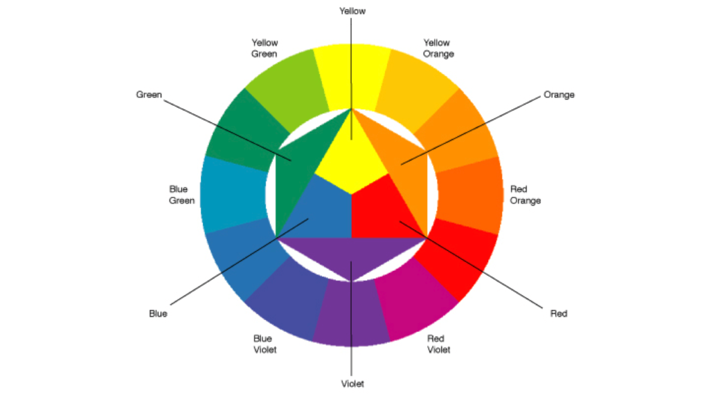
Combining a primary and secondary color creates tertiary colors. The primary color is always
listed first, followed by the secondary color in the resulting color name. Yellow-green, red-violet,
red-orange, yellow-green, and blue-green are a few examples.
Try Experimenting With Watercolors
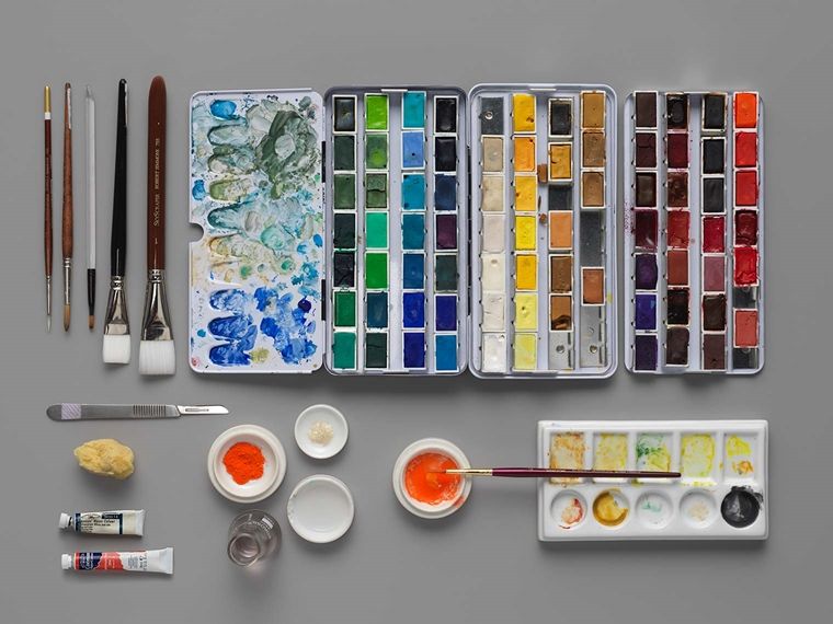
Consider blending watercolor paints. If you don’t have watercolors, try a similar exercise with
colored pencils, acrylics, pastels, crayons, markers, colored tissue paper that can be layered, or
anything else that can be combined, layered, or blended on paper to create a visual impact. If
you want, cut your paper into strips, so you can reference the results when choosing your fabric.
Start by combining primary colors to create yellow, green, and violet. Aim to match a secondary
hue as closely as possible to offer yourself a clear and vibrant color sample. Make your
secondary colors next. Start combining colors and see the results. Even if some of it will appear
unpleasant, it’s okay. You are becoming more knowledgeable about color and the components
of new hues.
Now that you have your colors, it’s time to add black to them to make shades and darken a hue.
An interesting result of mixing black and yellow is a dull olive green. White can then be added to
create tints and brighten hues. Try blending shades directly opposite one another on the color
wheel for some serious excitement. Depending on the colors that make up the resultant hue, the
outcomes can range from producing distinct brown hues to creating varied gray tones.
After completing this exercise on shades, tints, and tones, you’ll begin to see how adding black,
white, or a complementing hue has altered the original color’s strength and value.
Intensity and value greatly influence relative contrast and the reasons why specific colors
appear dull and others dazzling. A good general rule of thumb is to choose fabrics with the
same relative power but different values to create an overall feeling of oneness. All vibrant
colors appear less vibrant when used in the same quilt or artwork. Additionally, due to their
similarity, the colors make sense together if the palette is muted or duller. That is merely an
illustration and not a firm rule.
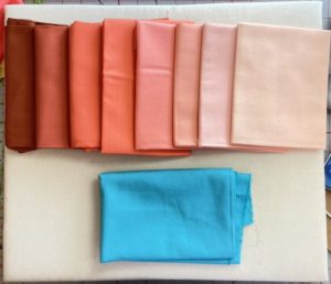
Visually Apply This Experiment To Choosing Fabric Colors
You can apply this when choosing fabric. Modern quilting is all about improvising! In painting,
blending color intensities frequently results in a focal point where the pure, vivid hue stands out
over the more subdued tones. To make objects advance or retreat in a painting, artists
frequently use shades of various intensities, temperatures (warm or cool), and values. Contrast,
which indicates the degree of difference between two or more colors, is quite similar to intensity.
As quilters, we are aware that contrast dramatically influences how a block reads or how a quilt
pops. When contacting colors (or prints) have little to no distinction, the overall appearance is
flat and may appear to be one solid mass from a distance.
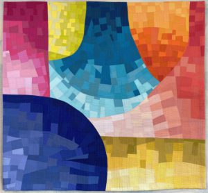
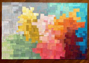
Imagine a pattern of overlapping circles that you want to create the look of transparency. So the
overlapping section of the two circles will be a mixture. That means using dark, medium, and
light contrasting colors is a fantastic method to make transparency sections successful. Dark,
medium, and light contrasts can be placed in any sequence, but using a medium (mixed result)
color in the transparency region will be most effective for producing the appearance of
transparency using a dark color on a circle, and a light colored circle is overlying it.
The paint or composite sample you intend to use may need to be cut out. Choose a cloth that
matches your favorite hues and color schemes as closely as possible. Don’t feel you must
adhere to your mixed samples precisely; you may need to make adjustments based on the
colors of the fabrics within your access. Apply the knowledge you gained from this mixing
exercise, and you’ll soon be able to make decisions regarding color mixing with confidence in
your mind’s eye. To choose the transparent fabric color that nearly resembles the “mixed”
outcome form, remember to pay great attention to, as if you could mix fabrics like you can
watercolor. This is a great way to improvise in modern quilting.
Using color theory will help you in a wide variety of different ways with your quilts; you may add
context, depth, and other effects to your quilts. Taking a quilting theory course can teach you
about special effects like transparency. You will learn how various color aspects interact, which
will improve your understanding of making stunningly original quilts.